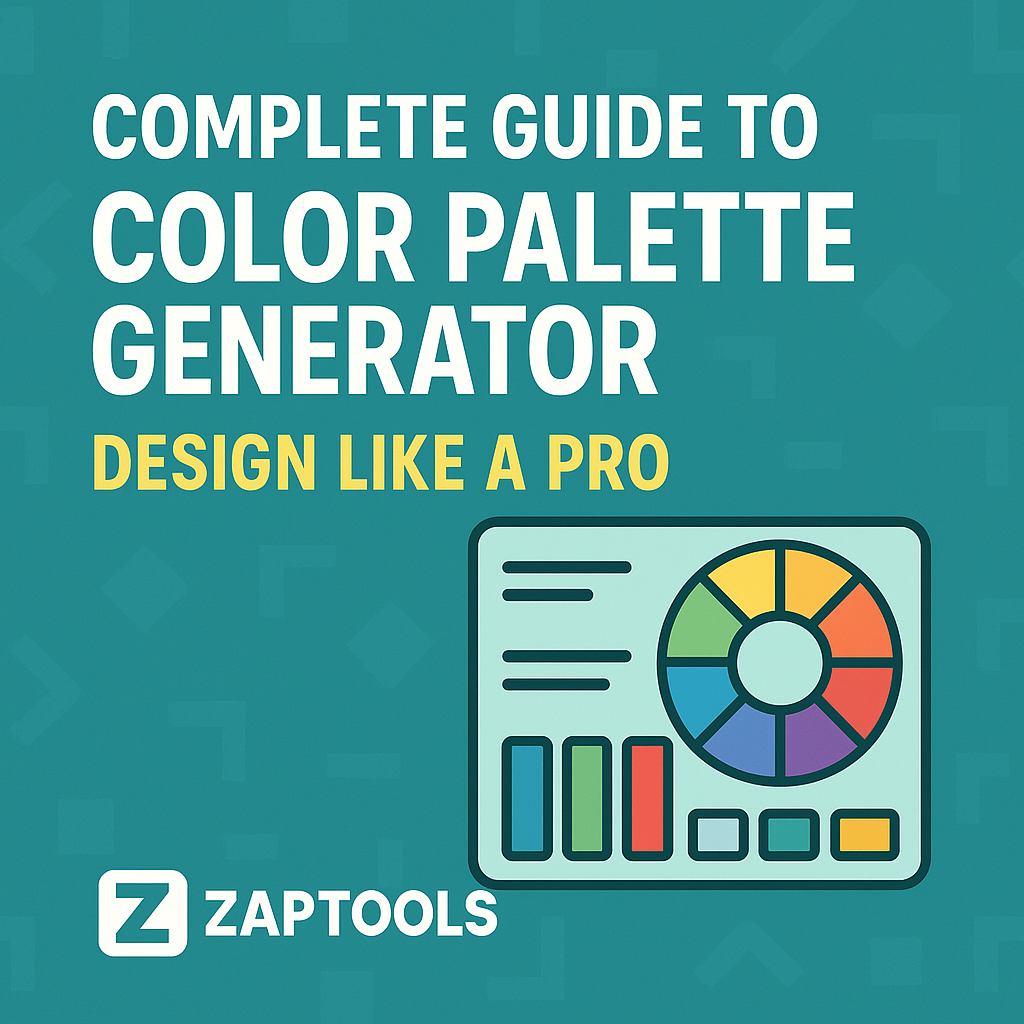
Complete Guide to Color Palette Generator: Design Like a Pro
Complete Guide to Color Palette Generator: Design Like a Pro Color is one of the most powerful tools in design. It can evoke emotions, guide user a...
Complete Guide to Color Palette Generator: Design Like a Pro
Color is one of the most powerful tools in design. It can evoke emotions, guide user attention, and create memorable brand experiences. But creating the perfect color palette can be challenging. That's where our Color Palette Generator comes in - a free online tool that helps you create beautiful, harmonious color schemes for any project.
Why Color Palettes Matter
Before diving into how to use our tool, let's understand why color palettes are crucial:
- Brand Recognition: Consistent colors help users identify your brand instantly
- User Experience: Good color choices improve readability and usability
- Emotional Impact: Colors can influence how users feel about your product
- Accessibility: Proper contrast ratios ensure your design is inclusive
Understanding Color Theory
The Color Wheel
The color wheel is the foundation of color theory. It shows the relationships between colors:
- Primary Colors: Red, blue, yellow
- Secondary Colors: Green, orange, purple (created by mixing primaries)
- Tertiary Colors: Colors between primary and secondary
Color Harmonies
Our Color Palette Generator supports five main color harmony types:
1. Monochromatic
Variations of a single color. Perfect for creating a cohesive, sophisticated look.
Best for: Minimalist designs, professional websites, elegant branding
2. Analogous
Colors next to each other on the color wheel. Creates a harmonious, natural feel.
Best for: Nature-inspired designs, warm and inviting interfaces
3. Complementary
Colors opposite each other on the color wheel. Creates high contrast and visual interest.
Best for: Call-to-action buttons, highlighting important elements
4. Triadic
Three colors equally spaced on the color wheel. Balanced and vibrant.
Best for: Creative projects, children's websites, energetic brands
5. Tetradic
Four colors forming a rectangle on the color wheel. Rich and complex.
Best for: Complex designs, artistic projects, when you need many colors
How to Use Our Color Palette Generator
Step 1: Choose Your Base Color
Start with a color that represents your brand or project. Consider:
- Your brand's personality
- Your target audience
- The emotions you want to evoke
- Industry standards
Step 2: Select a Color Scheme
Choose from our five harmony types based on your design goals:
- Monochromatic: For elegant, sophisticated designs
- Analogous: For natural, harmonious looks
- Complementary: For high contrast and energy
- Triadic: For balanced, vibrant designs
- Tetradic: For complex, rich color schemes
Step 3: Copy Your Colors
Our tool provides colors in multiple formats:
- HEX: Perfect for web development (#FF6B6B)
- RGB: Great for digital design (255, 107, 107)
- HSL: Ideal for design software (0°, 100%, 71%)
Step 4: Check Accessibility
Use our built-in accessibility checker to ensure your colors meet WCAG guidelines:
- 4.5:1 ratio: Minimum for normal text
- 3:1 ratio: Minimum for large text
- 7:1 ratio: Enhanced contrast for better accessibility
Color Psychology in Design
Red
- Emotions: Energy, passion, urgency
- Best for: Sales, food, entertainment
- Use cases: Call-to-action buttons, sale announcements
Blue
- Emotions: Trust, stability, professionalism
- Best for: Corporate, technology, healthcare
- Use cases: Business websites, medical apps
Green
- Emotions: Growth, nature, health
- Best for: Environmental, wellness, finance
- Use cases: Eco-friendly products, health apps
Yellow
- Emotions: Optimism, creativity, warmth
- Best for: Children's products, creative industries
- Use cases: Educational content, creative portfolios
Purple
- Emotions: Luxury, creativity, mystery
- Best for: Premium brands, creative services
- Use cases: Luxury products, artistic portfolios
Orange
- Emotions: Enthusiasm, adventure, confidence
- Best for: Sports, travel, food
- Use cases: Travel websites, food delivery apps
Accessibility Best Practices
Contrast Ratios
- Normal text: Minimum 4.5:1
- Large text: Minimum 3:1
- Enhanced: 7:1 for better accessibility
Color Blindness Considerations
- Don't rely solely on color to convey information
- Use patterns, icons, or text labels
- Test your designs with color blindness simulators
Tips for Better Accessibility
- Use high contrast combinations
- Avoid red-green combinations
- Provide alternative text for color-coded information
- Test with actual users when possible
Real-World Examples
E-commerce Website
Base Color: #2563EB (Professional Blue) Scheme: Analogous Result: Trustworthy, professional appearance perfect for online shopping
Creative Portfolio
Base Color: #EC4899 (Vibrant Pink) Scheme: Triadic Result: Creative, energetic design that showcases artistic work
Healthcare App
Base Color: #10B981 (Calming Green) Scheme: Monochromatic Result: Soothing, professional interface that builds trust
Advanced Tips
Creating Brand Guidelines
- Choose 3-5 main colors
- Define usage rules for each color
- Create variations for different contexts
- Document everything for consistency
Seasonal Updates
- Spring: Fresh greens and pastels
- Summer: Bright, energetic colors
- Fall: Warm oranges and browns
- Winter: Cool blues and whites
Cultural Considerations
- Research color meanings in your target markets
- Avoid colors that might be offensive
- Consider local preferences and traditions
Exporting and Using Your Palettes
CSS Export
Our tool generates ready-to-use CSS variables:
:root {
  --color-1: #FF6B6B;
  --color-2: #4ECDC4;
  --color-3: #45B7D1;
  --color-4: #96CEB4;
  --color-5: #FFEAA7;
}
Design Software Integration
- Figma: Import colors as styles
- Adobe Creative Suite: Save to swatches
- Sketch: Create color variables
Common Mistakes to Avoid
Too Many Colors
- Stick to 3-5 main colors
- Use variations for accents
- Maintain visual hierarchy
Poor Contrast
- Always check accessibility
- Test in different lighting conditions
- Consider mobile devices
Ignoring Context
- Consider your audience
- Think about usage scenarios
- Test across different platforms
Conclusion
Creating the perfect color palette doesn't have to be overwhelming. With our Color Palette Generator, you have a powerful tool that combines color theory, accessibility, and practical design principles.
Remember:
- Start with a strong base color
- Choose harmonies that match your goals
- Always check accessibility
- Test your palettes in real contexts
- Keep your brand consistent
Ready to create stunning color palettes? Try our Color Palette Generator now and transform your designs with professional color schemes!
Need more design tools? Check out our Story Cover Maker for creating beautiful social media covers, or our Fancy Fonts Converter for unique text styling.